Ranger

What does it take to earn 98% adoption?

Product Designer iPad App B2B SaaS Veterinary Tech
Built for adoption
98%Team adoption
18%Faster documentation
78%Pet-switch adoption

Before redesign
After redesign

Background

At The Vets, veterinarians and technicians run every visit, from scheduling to billing, inside one iPad app.

Problem

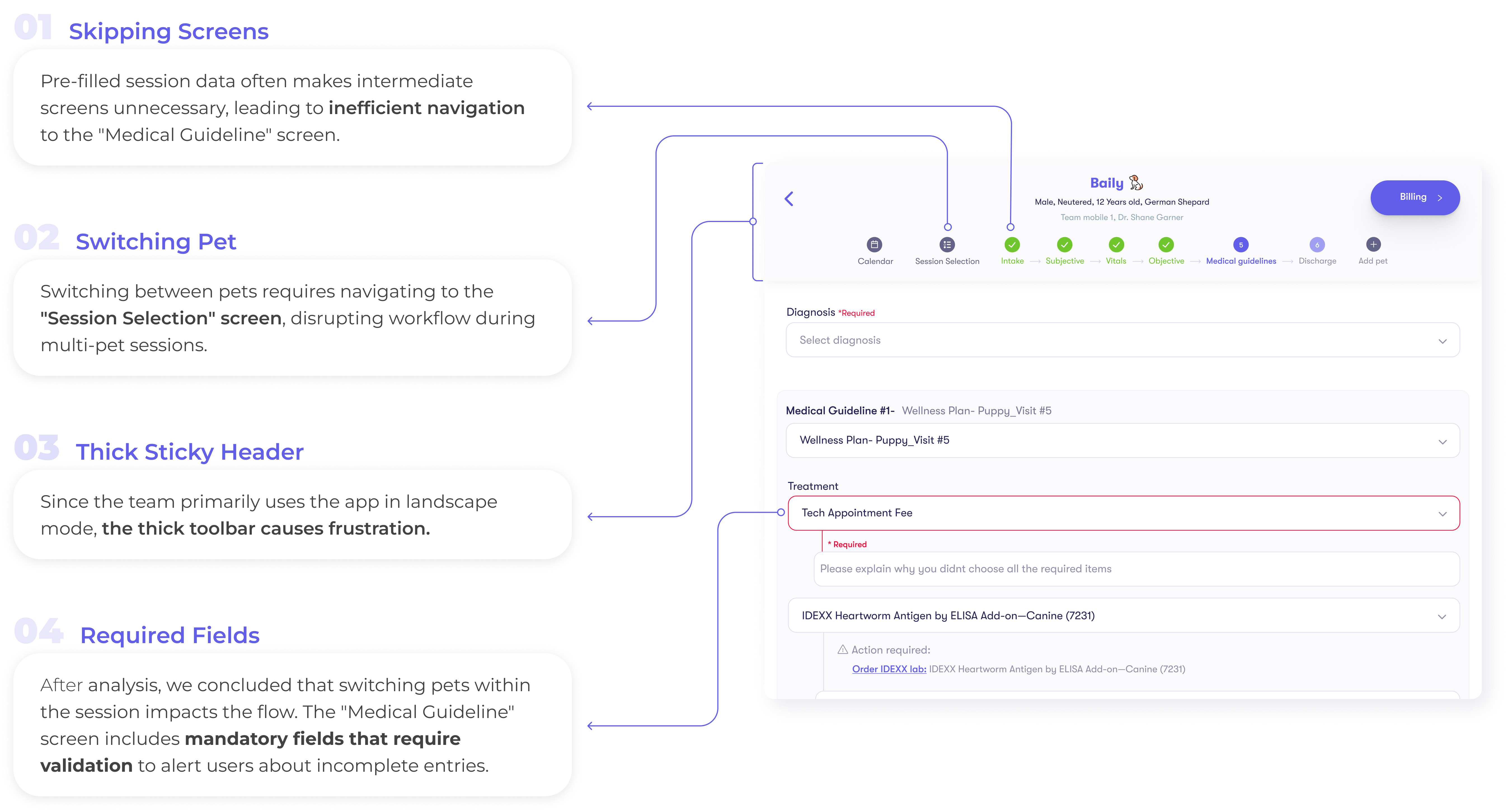
The flow didn't match the vet's visit. It forced vets through screens they didn't need and pulled them away from the pet into the app.

Approach

Rebuilt the flow around the real treatment process within the existing architecture and made it work across both iPad orientations.

Result

The team adopted it. Documentation runs 18% shorter, so vets fit more visits into their workday.

Overview

The challenge

Ranger is the iPad app veterinarians and technicians at The Vets run every visit inside, from scheduling to billing. I owned the redesign of the treatment session itself: the part of the app a vet is standing in while a pet is on the table.

UX Metrics

UX KPIs results

A few months after each improvement shipped, I measured it against the UX KPIs I had set.

Documentation Time

18%

Reduction in time spent documenting per session

Feature Utilization

56%

Increase in advanced feature usage across teams

Pet-Switch Adoption

78%

Of users actively using pet-switch within 4 weeks

Internal Research

Ranger survey

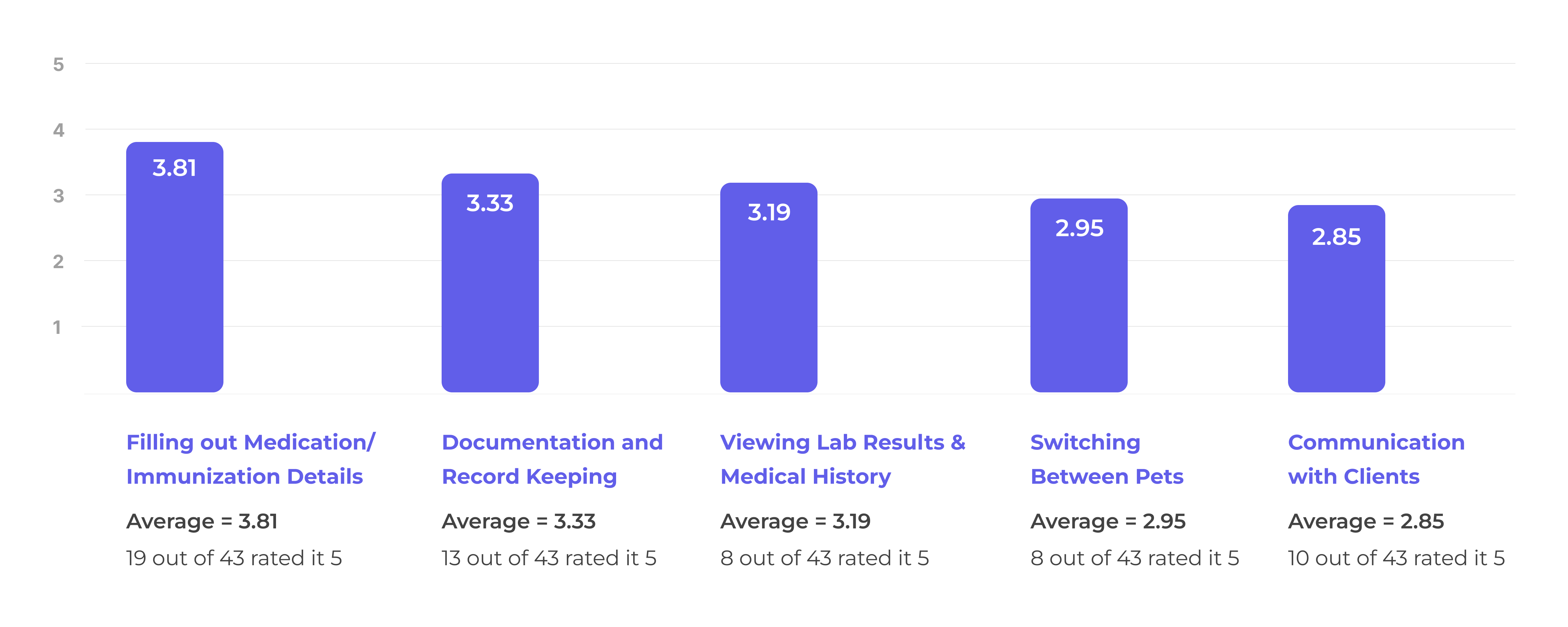
I ran this survey to find out where Ranger was costing veterinary teams time, and which of those costs were worth designing against.

Survey Results

I asked the medical teams to rate how time-consuming they found each task, from 5 (very time-consuming) to 1 (not time-consuming).

Survey Results

User Research

Personas

I designed for two people: the veterinarian running the visit, and the technician documenting it beside them.

Veterinary technicians assist the veterinarians during medical treatments and are primarily responsible for documenting the visit in the app.

Personas

Design Decisions

Key Ranger improvements

Better access to medical record

Direct access from the session screen to the pet's full medical record and treatment history.

Effort
Impact

Faster documentation

I pre-filled the fields vets repeat every visit, which is where most of the documentation time was going.

Effort
Impact

Streamlined session

I rebuilt the session flow so moving between pets and screens takes 30% fewer taps.

Effort
Impact

Ranger Redesign

Streamlined session

I read the session funnel against the user research, found where vets were losing time, and cut the flow down to what a visit actually needs.

Old session screen

Final Design

Designed screens

I took these from research through wireframes to hi-fi, scoping each one against what engineering had time to build.

Faster Documentation

Auto-fill from last visit

Vets were retyping the same values visit after visit, so I pre-filled Intake and Subjective from the last session.

Immunization and Medication Auto-Fill

Faster Documentation

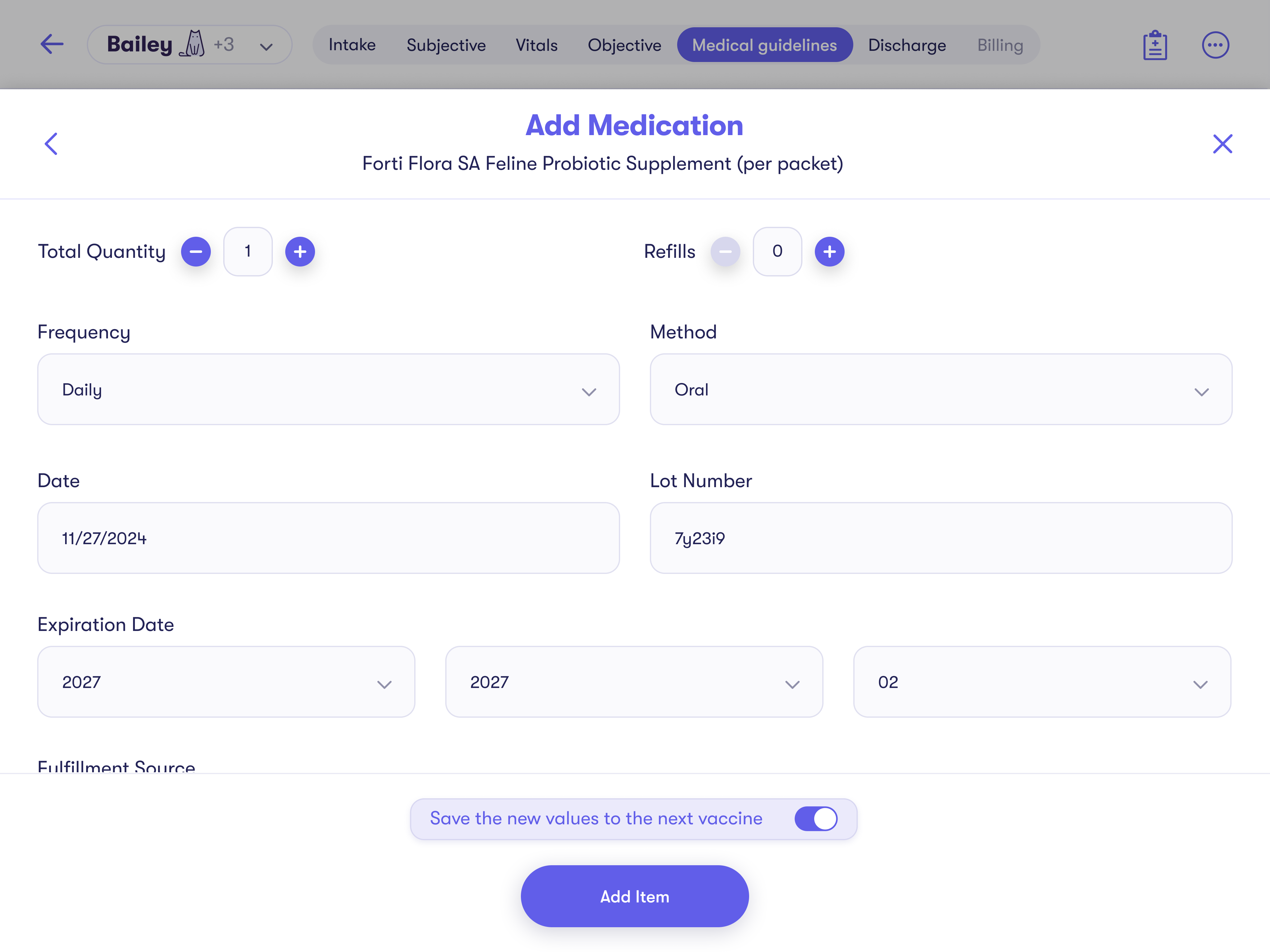
Immunization and medication auto-fill

Auto-fill is now applied to commonly repeated fields. A toggle lets users save values and reappears only if changes are made. A disclaimer shows when the data was last saved.

Streamlined Session Navigation

Flexible step access

To hit the 30% tap-reduction KPI, I turned the fixed step-by-step flow into tabs a vet can move through in any order.

Switching between pets

Users can switch between pets during a session via a dropdown in the session header.

Streamlined Session Navigation

Direct medical record access

Several vets told me they could not reach Medical Records from inside a session, so I put a dedicated button in the session header, alongside the existing option in the header menu.

Next case studies

Thanks for reading.

If you have any questions, feedback or would like to discuss my work further, feel free to get in touch.